The Mission
The previous branding had grown outdated, needing a fresh and invigorating new look for the company. While the existing logo was to be retained, the overall branding required a modern update.
The Process
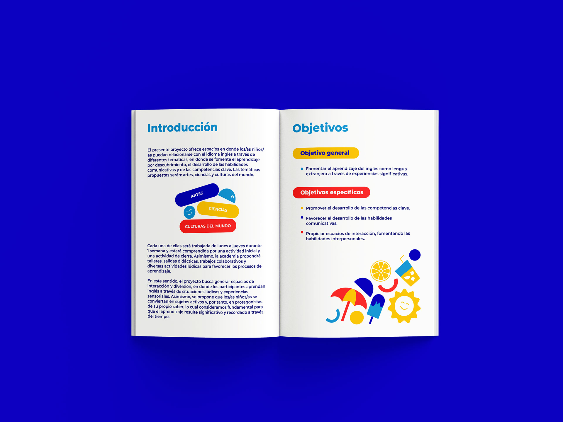
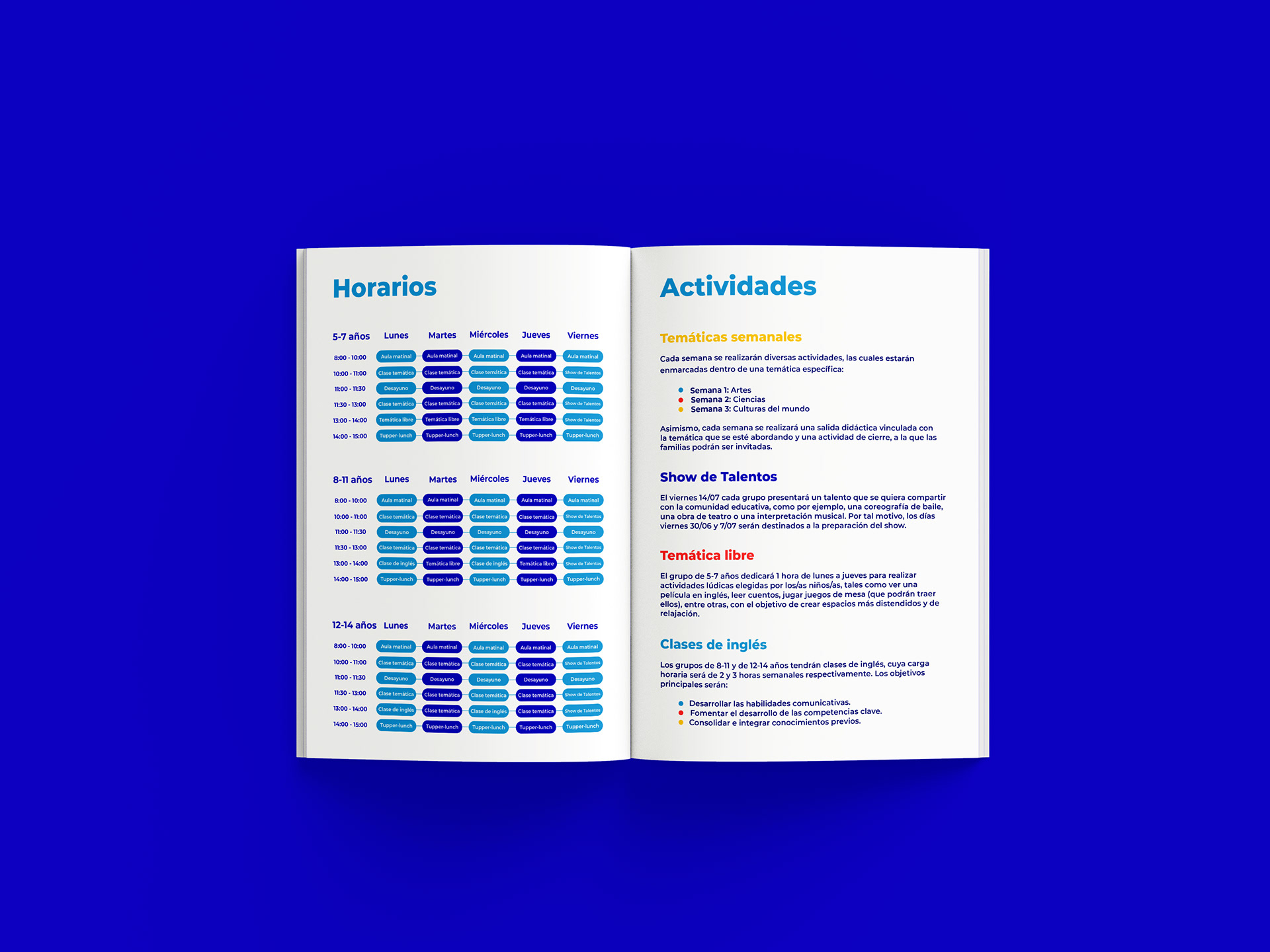
Drawing inspiration from the logo, I devised a set of dynamic shapes that became a versatile visual element throughout the brand. These shapes infused a sense of fun and playfulness, capturing the essence of the school’s ethos. To amplify this lively spirit, I employed a vibrant and playful colour palette, saturating the brand materials with energy and enthusiasm.
The Outcome
The reimagined branding breathed new life into OC Languages, aligning it with the contemporary landscape while honouring its rich heritage. The revitalised visual identity not only attracted attention but also conveyed the school’s commitment to engaging and effective language education.
Through my design choices, I sought to create a cohesive and impactful brand experience that reflected the excitement and joy of language learning. The vibrant colours and playful shapes brought dynamism to various touchpoints, including marketing collateral, website design, and signage, leaving a memorable impression on students and the community. The rebranding initiative for OC Languages stands as a testament to my ability to breathe fresh vitality into established brands while maintaining a sense of continuity. By infusing the company’s existing logo with modern elements and vibrant aesthetics, I successfully revitalised the brand’s image, allowing OC Languages to continue its mission of fostering language learning in a vibrant and engaging environment.

