The Mission
The primary objective was to design a logo that embodies the project's dynamic collaboration and adapts to diverse applications, showcasing both the diversity of languages and the partners involved.
The Process
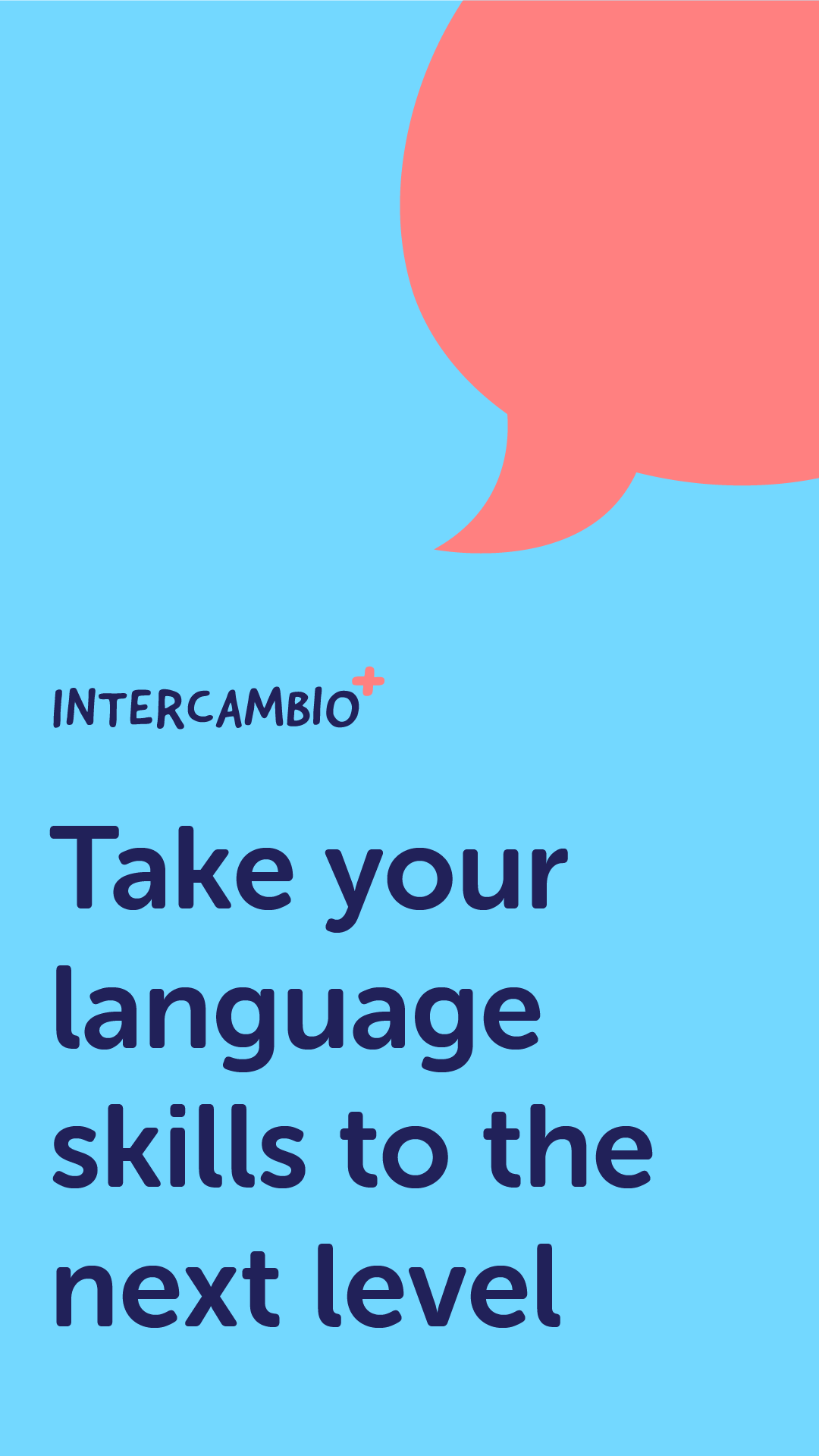
To reflect the project's flexibility and innovative approach, I employed an interchangeable color palette in the logo design, ensuring its adaptability across various contexts. A hand-drawn font was chosen to add a personal touch, making the logo feel more authentic and relatable. The design was kept simple yet modern, capturing the essence of the project while making it approachable to potential learners.
The Outcome
The resulting logo for "Intercambio Plus" is versatile and engaging. The interchangeable color palette ensures it resonates well in various applications, and the hand-drawn font gives it a unique identity. This design project is a testament to my ability to distill complex concepts into clear, visually appealing designs, reinforcing the project’s core values and goals.
